Hey there, friends! Are you eager to create mobile banner ads that really make a splash? Well, you have come to the right place! Mobile advertising is all the craze in today’s digital age, but creating effective banner ads can be tricky.
But don’t worry because we are here to help you out! In this blog, we will tell you about 5 essential tips that will take your mobile banner ads from meh to marvelous. We will cover everything from eye-catching designs to irresistible calls to action. By the time you are done reading, you will be armed with all the knowledge you need to create banner ads that genuinely shine on mobile devices. So, let’s dive in and make your ads the talk of the town!
What Are Banner Ads and Their Significance?
Banner ads are those colorful rectangles or squares you often see on websites. They are like mini billboards on the internet. They aim to catch your attention and interest you in something, like a product or a service. Imagine scrolling through a website, and suddenly, there it is—a flashy banner ad. It might have eye-catching images, catchy phrases, and even buttons you can click on.
These ads are created by businesses who want to promote what they have to offer and get you to visit their website. Sometimes, banner ads can be a bit annoying, but they help websites make money. Advertisers pay the website owners when people click on those ads. So, it’s like a win-win situation. The website makes some cash, and the advertiser gets more people to check out their stuff.
Size and Shape of Banner Ads
Banner ads come in different shapes and sizes. Some are long and skinny, while others are big and square. It all depends on where the website wants to put the ad. You can spot these ads on news websites, social media platforms, and mobile apps. They are pretty much everywhere!
Benefits of Mobile Banner Ads
Now, let’s talk about the advantages of mobile banner ads
Increased Visibility
Mobile banner ads are on your screen, in your face, and hard to ignore. They grab your attention and make you notice what they have to offer. This means companies can reach a wider audience and communicate effectively.
Targeted Advertising
These ads are smart! They use unique technology to show advertisements relevant to your interests and preferences. This means you are more likely to see something you care about. It’s like having personalized recommendations right on your phone.
Cost-Effective
For businesses, mobile banner ads are a cost-effective way to advertise. They don’t require a massive budget like TV or radio ads. Advertisers can reach a large number of people without breaking the bank. It’s a win-win for both businesses and consumers.
Easy Interaction
Mobile banner ads usually have buttons or links that you can tap on. This makes it super easy for you to explore more about the advertised product or service. With just a simple tap, you can be directed to a website, a social media page, or even a special offer.
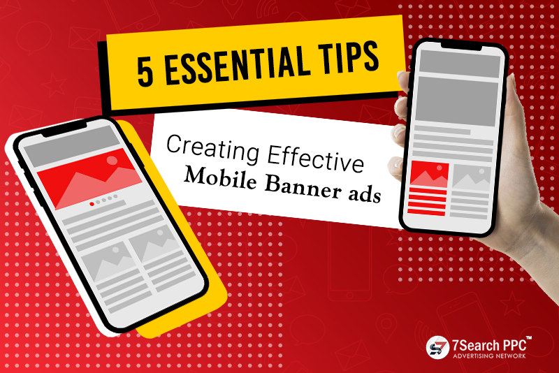
5 Essential Tips for Creating Effective Mobile Banner Ads:
Absolutely! Here are 5 essential tips for creating compelling mobile banner ads, explained in simple and easy-to-read language:
Keep It Simple
When it comes to mobile banner ads, less is more. Keep your message clear and concise. Use simple and easy-to-understand language. Avoid cluttering the ad with too much information or too many visuals. Remember, you only have a small space to work with, so make every word and image count.
Grab Attention
Mobile users have short attention spans, so you must grab their attention immediately. Use eye-catching colors, bold fonts, and compelling visuals to make your ad stand out. Consider using animation or motion to make it even more attention-grabbing. Just remember to hold a balance between being eye-catching and being annoying.
Call to Action
Don’t leave your audience hanging! Include a clear and compelling call to action in your mobile banner ad. Tell them what you want them to do, whether it’s “Shop Now,” “Learn More,” or “Download Now.” Ensure the call to action is prominently displayed and easy to tap on.
Optimize for Mobile Devices
Mobile banner ads are specifically designed for smartphones and tablets, so make sure your ad is optimized for these devices. Ensure that your ad fits the screen properly, loads fast, and is easy to interact with using touch gestures. Test your ad on various devices to ensure a seamless user experience.
A/B Testing
Don’t settle for mediocrity! Test different versions of your mobile banner ad to see which one performs better. Try out different colors, images, headlines, and calls to action. A/B testing lets you make data-driven judgments and optimize your ads for maximum effectiveness. Keep testing and refining your ad until you find the winning combination.
How to Make Your Banner Ads Look Attractive?
Alright! Let’s talk about how to make your banner ads look attractive simply:
- Catchy Colors: Choose colors that grab attention and evoke the right emotions. Bright and bold colors can be eye-catching, but ensure they align with your brand and don’t overwhelm the viewer. Consider using contrasting colors to make key elements stand out.
- Compelling Images: Use high-quality and relevant images that resonate with your target audience. Use images that showcase your product or service in action or evoke positive emotions. Avoid using generic stock photos and opt for authentic visuals that tell a story.
- Concise Messaging: Keep your message clear and concise. Use short and impactful headlines or taglines that immediately communicate the benefit or value of your offering. Avoid cluttering the ad with excessive text; focus on a compelling message that captures attention.
- Engaging Fonts: Choose fonts that are relevant and align with your brand personality. Consider using bold and attention-grabbing fonts for headlines while using more straightforward and more readable fonts for body text. Ensure the font sizes are appropriate for mobile devices, making it easy to read on smaller screens.
- Simple Layout: Keep the layout of your banner ad clean and uncluttered. Avoid overcrowding the ad with too many elements. Give each aspect enough breathing space to stand out. Use white space strategically to create a sense of balance and draw attention to the essential elements.
- Call to Action: Include a clear and compelling call to action (CTA) that inspires the viewer to take the desired action. Use action words like “Shop Now,” “Learn More,” or “Get Started.” Make the CTA visually prominent and easy to tap on mobile devices.
- Responsive Design: Ensure your banner ads are designed to be responsive and adapt to different screen sizes. This way, your ads will look great on desktop and mobile devices, providing a seamless user experience.
- Test and Optimize: Don’t settle for the first version of your banner ad. Try different approaches to see which ones perform best. Experiment with different colors, images, fonts, and layouts. Analyze every piece of information and make data-driven decisions to optimize your ads for maximum effectiveness.
The Bottom Lines:
To wrap up, creating effective mobile banner ads doesn’t have to be complicated. By following these 5 basic tips, you can make your ads stand out and drive engagement. Keep it simple and grab attention with eye-catching colors and visuals. Include a clear call to action that prompts users to take action. Modify your ads for mobile devices to ensure a seamless user experience. And don’t forget to test and refine your ads based on data. With these tips in mind, you’ll be well on your way to creating attractive banner ads that capture attention, drive clicks, and achieve your advertising goals. Happy creating!

