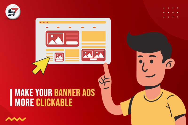
What if we tell you that you can make your banner ads more clickable? Yes, you heard it right; today, we will be talking about some ways in which you can make your banner ads more clickable. Many marketers use these ads in their marketing strategy, but they don’t get the desired results they want from their campaigns.
The problem is that they never focus on effective ways to make their banner advertising more engaging. But every problem comes with its solution, and your solution is here in this blog.
Banner Ads: A Digital Spotlight
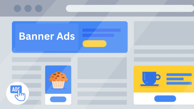
Friends, let’s not waste a single moment and try to understand what banner ads are and why marketers give first preference to these ads. These are powerful advertisements displayed on web pages or mobile apps, typically in the form of images, GIFs, etc.
These ads come in various sizes and formats, including leaderboard, skyscraper, rectangle, etc. The best part of these ads is that they are often placed strategically on websites to attract the attention of the audience and boost brand awareness for businesses.
Diverse World Of Banner Ads
There are various formats of banner ads available for advertisers. Understanding each type of banner ad is crucial for you to determine the best format that perfectly aligns with your advertising objective. We have researched the five formats that can help you to make your ad campaign successful.
Static Banner Ads
After knowing the nature of static banner ads, it’s time to discuss the next format, and its name is animated banner ads. These ads include moving images and visuals, sometimes accompanied by audio that helps advertisers grab the eyes of the audience quickly.
These ads are created in the form of GIFs or HTML5 animation, and with the help of animated banner advertising, you can tell a story to engage the audience.
Animated Banner Ads
These ads are a type of online advertising that utilizes high-quality video content in a banner ad format. These ads incorporate dynamic video content to capture the audience’s attention and deliver messages in a more engaging and visually appealing way. The motive behind creating these ads is to promote products, services, or brand messages through short video clips.
Video Banner Ads
These ads are a type of online advertising that utilizes high-quality video content in a banner ad format. These ads incorporate dynamic video content to capture the audience’s attention and deliver messages in a more engaging and visually appealing way. The motive behind creating these ads is to promote products, services, or brand messages through short video clips.
Interactive Banner Ads
They are designed to engage the audience by allowing them to interact with the banner. These ads are visually appealing and focus on displaying the company’s imagery through innovative and clickable elements. These ads take full responsibility for encouraging active participation and enhancing user engagement.
Transitional Banner Ads
Transitional banner ads are a type of online advertisement that appears on a website while it is loading. These ads are designed to display quick messages since they only appear for a short amount of time. These short messages are so much liked by the audience because they capture attention without causing significant disruption to the user’s browsing experience.
8 Tactical Tips For Crafting Banner Ads That Drive Engagement
It is essential to create clickable banner ads to have a successful advertising campaign. We have researched the proven tips that can help you make your ads more clickable. Here it is –
Simple Design Creates Big Impact
In our daily lives, we mostly follow the quote that ‘simplicity allows us to focus on what truly matters‘; this also applies to crafting banner ads in digital advertising. Many audiences do not like extra colors, texts, or images in banner advertising, and this is the biggest reason behind the failure of the banner ad campaign.
If you want your banner ad to provide you with a good result, then you must focus on simplicity rather than overwhelming it with excessive colors, text, or images. Here, you can consider the following points –
- You must use clear and concise messaging in your banner ad to communicate your value proposition.
- While crafting the banner ad, you should avoid overloading the banner ad with too much text or images.
- Remember to use short and powerful words that resonate with your target audience.
Standard Banner Sizes For Maximum Effectiveness
The size of these ads plays a crucial role for advertisers in attracting and engaging the audience with their content effectively. We asked many advertisers about their preferred size of banner advertising. We found that most of them really don’t care about the size of banner ads.
Friends, when it comes to online advertising, the perfect banner ad sizes can make all the distinctions between a successful campaign and an unsuccessful one. We have researched the common banner ad sizes for you –
- 250 x 250
- 300 x 250
- 468 x 60
- 728 x 90
- 160 x 600
- 300 x 600
Strategic Placement Of Banner Ads
The next tactical tip that we would like to share with you is the strategic placement of banner ads. Strategically placing these ads is similar to choosing the perfect spot for a sign on a busy street.
The perfect placement of these ads is advantageous for banner advertisers because it helps them display their ads in a location where they are most likely to be seen by potential audiences. Just like a well-located store, the right ad placement can increase the chances of more visitors. Here are the following points that you must remember while seeking a placement for your ads –
- You must consider the duration of your banner ad placement. Short-term campaigns may work for certain promotions, while long-term placement can build brand awareness.
- Conduct competitor research to analyze their banner advertising strategies and identify opportunities to differentiate or target alternate banner ad platforms or display ad networks for better results.
- It is essential for you to evaluate website traffic and user engagement. High traffic and user engagement can boost the visibility of your ads.
Call To Action: Your Ticket To Positive Results
Have you ever heard about the most focused word, “CTA”? So, guys, Your CTA is like the boss of your banner ads, and if it’s not good, you won’t get the results you want.
A CTA is the part of your ad that tells the viewer what to do, like “Click here” or “Buy now.” If your CTA is weak or confusing, people won’t know what to do, and they will just move on. But if your CTA is clear and compelling, you will see more people taking action and clicking on your ad. So, make sure your CTA is the bomb, and you will be on your way to more banner ad clicks.
The Game Of Visuals
If you want to level up your banner ad game and get more clicks, you have to focus on your visuals. Using the right images and colors can make a big difference in catching people’s attention and getting them to click.
First off, make sure you are using high-quality images that are clear and engaging. Audiences are more likely to engage with a banner ad that looks good and captures their interest. Plus, using images that relate to your product or service can help people understand what you are offering and why they should click.
Next, think about color psychology. Diverse colors can evoke different emotions, so choose colors that perfectly fit with your brand identity and the message you are trying to convey. For example, red can create a sense of urgency, while blue can convey trust and reliability.
You can also play around with different layouts, fonts, and text to see what works best. Just make sure your ad isn’t too cluttered and that the text is easy to read. In short, when it comes to banner ads, visuals are key.
White Spaces Can Also Help To Get More Clicks
So, readers, when it comes to designing effective banner ads, one often overlooked element is whitespace. You know, the empty space between and around the text, images, and other elements in your ad. But let me tell you, white space is like the secret sauce that can take your ads from meh to amazing.
Firstly, whitespace creates balance in your ad. It helps to distribute the visual weight of the different elements, making your ad feel cohesive and pleasing to the eye. When your ad is well-balanced, users are more likely to engage with it and click on it.
White space also plays a big role in guiding users’ attention. By using white space effectively, you can draw users’ eyes to specific elements, like your call-to-action button or your key message. This helps to convey your message more clearly and effectively, increasing the chances that users will click on your ad.
Use Responsive Design
If you are creating effective banner ads, one of the key considerations is the device your audience uses to view your ad. With people browsing the web on desktops, laptops, tablets, and mobile devices, it’s essential to design your mobile banner ads to be responsive and optimized for each type of device.
The reason is simple: different devices have different screen sizes, user interactions, and expectations. For example, a banner ad that looks great on a desktop might not display properly on a mobile device or be challenging to read on a smaller screen.
Similarly, an ad designed for a desktop user using a mouse to click might be less effective for a mobile user using their finger to tap.
Storytelling Can Also Be A Secret Weapon
Do you know how a good story can captivate you and draw you in? Well, the same principle applies to banner ads. Using storytelling techniques in your ads, you can relate with your audience and encourage them to click on your ad.
Stories create an emotional connection. People are likely to engage with an ad that evokes an emotional response, like happiness, excitement, or nostalgia. You can tap into these emotions by telling a story in your banner ad and create a stronger connection with your audience.
Wrap-Up Lines
There you have it, folks! 8 handy tips to help you create banner ads that are more engaging, memorable, and, most importantly, more clickable.
So, go forth and create banner ads that are not only effective but also a pleasure to look at. Friends, always remember that the key to success is testing, experimenting, and optimizing your ads based on what works best for your audience.
Happy ad creating, and may the clicks be ever in your favor!
Frequently Asked Questions (FAQs)
Why are banner ads important?
Ans. Banner ads help businesses increase brand awareness, drive website traffic, and generate potential leads.
Should I include animation in my banner ads?
Ans. Yes, you should include animation in your banner ads. It can help you grab your audience’s attention and boost engagement.
Should I include pricing or discounts in my banner ads?
Ans. Yes, you should include pricing or discounts in your banner ads. Including pricing, discounts, and offers can make your banner ads more compelling, but ensuring they are clear and not misleading is essential.
What can I do if my banner ads are not performing well?
Ans. You can use the following tactics if your banner ads are not performing well-
- Analyze The Performance Data
- Identify Areas For Improvement
- Consider Adjusting Banner Ads Elements (Ad Copy, CTA, Colors)

